Client: AOS, American One Source
Art Direction: Myself & Anthony Edwards
of HTR.
Goal: The main goal I set for myself during this project was to provide a fresh voice to an often overlooked and under-treated design area, Human Resources.
AOS provides the support to its clients to cost-effectively outsource management of human resources, employee benefits, payroll and workers’ compensation insurance, safety and loss prevention, medical benefits and 401K retirement plan options.
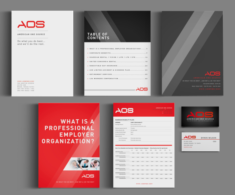
I was tasked to help with the re-branding of the company, as well as create & compile the company’s overview packet.
The client came to us with one request: that we give the look and feel an updated and timeless design. After one look at their previous site and design elements, I knew an immediate solution for this: more. white. space!
The previous logo design was outdated and hard to distinguish, as it was just typed out in the same typeface that was used elsewhere. After offering several variations of an updated logo mark, the client felt most drawn to the simple, yet bold, “AOS” but that didn’t seem refined enough for me and my art director.
Together, we collaborated on some further brainstorming which brought us to our decision to dissect a piece of the “A.” One of AOS’ main objectives as a company is brevity and quickness – to achieve their client’s objectives in the most efficient ways. We believed the use of the angles subtly symbolizes visual speed, right in their logo.
Advancing their new branding solution, I was tasked to design and develop the company’s overview packet, which is a 72-page publication. The original documents were in scattered and unorganized Word documents, with random bar graphs dispersed throughout, with no flow or continuity whatsoever. Funny – since this company is supposed to have their clients trust them with their paperwork…
After re-organizing the documents and communicating with the client for the correct order for this updated publication, I was able to then begin on the design aspects. Continuing with the angles and their simple color palette of red and black, I focused mainly on the content of each page, ensuring that every single word had room to breath, and was legible and easy for readers to digest such a bulk of information. The typeface, DIN, served as an excellent secondary font that resonated beautifully against the angles of the logo and throughout the publication. This project specifically taught me that negative space in charts and graphs can make a world of a difference.
Results: In the end, the client and my team rather enjoyed the way this book turned out. The new branding standards that I helped put in place, were able to, in turn, be implemented into their new website which can be viewed here.
![]()
![]()