Creative Roots Branding
Client: Creative Roots Landscaping
Art Direction: Myself & Virginia Green
Creative Roots Landscaping is a landscape architecture firm dedicated to creating a relationship between nature and fine arts within city limits. • For the website design, I chose a very user-centered design, with an innovative yet simple look and feel. The client desired a very eco-friendly style, yet not too “granola,” so, playing off of the angles and sharp edges of the logo mark, I kept everything as sharp as possible and used the brand’s color palette to tie in the economical means to adhere to the audience, yet give the appearance of a very forward thinking and cutting edge landscaping company. I especially admire the use of white space in other sites, so I wanted to include as much of that here as possible. The stark white space combined effortlessly against the chartreuse green and charcoal black which left plenty of space for the engaging call-to-actions to promote a returning visit.
A look into this logo creation process, shows you 4 different refined marks for this company’s logo. I wanted to try and create stellar options for each type of logo: wordmark, lettermark, emblem, & combination mark. In the end, we went with the more abstracted combination mark, which was the best fit in order to keep with the style and personality of the company.

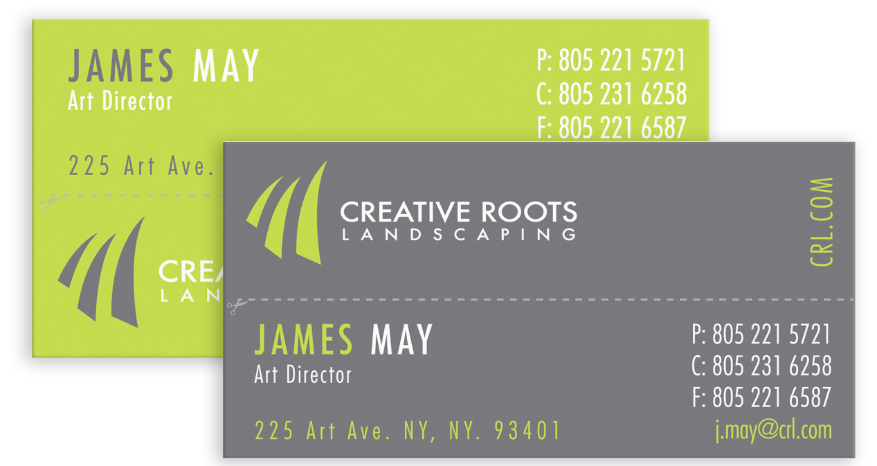
The overall idea for the business card was to have a “2-in-1” business card. Each side relays the same information when the card is in whole; however, if you were to fold and tear (along the perforated line in the middle), you would still be left with one smaller half of a business card, yet the information is flipped on the back, resulting in its own business card. Presenting the opportunity to have a tear-off business card, which could then be given to a friend!
Continuing with Creative Roots’ branding,
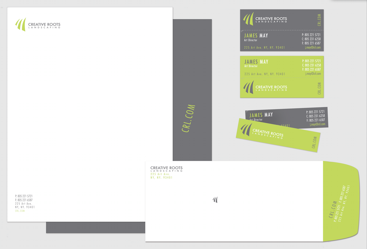
I developed a stationery set based on the strongest mark. I chose to emphasize the modernity and playfulness of Creative Roots. I designed each piece to tie into the next and create a very cohesive set, yet keeping each individual piece unique and with its own edgy personality.

