Logo Design for Angel Longevity Medical Center
Client: Angel Longevity Medical Center
Art Direction: Karen Barry of Flywheel Creative
Flywheel Creative, a wonderful branding agency in Austin, was working on an overhaul of the Los Angeles-based Medical Center, Angel Longevity. They already had their website well underway but needed to bring in some illustration help to update Angel Longevity’s existing logo. This was an incredibly fun yet challenging project to work on alongside Flywheel Creative. I especially enjoyed having the opportunity to watch a brand’s image transform from words on a piece of paper to a full-fledged identity facelift.
Angel Longevity Medical Center ensures its patients age gracefully and live their lives to the fullest using alternative treatments that focus on wellness rather than just treating and suppressing symptoms. The patients can be sure that they will receive optimal levels of care and the latest therapies in Anti-Aging and Functional Medicine.
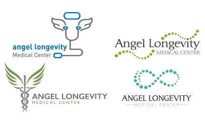
Strategy: At the start of every identity project, after familiarizing myself with the context of the logo brief, I try to do what I call a “word-vomit.” Pretty, I know. I start by writing down the name of the client, in this case, “Angel Longevity” and then immediately begin writing any word that comes to mind that may or may not have an association with the words in the client’s name.
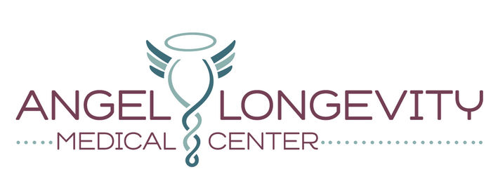
Once we landed on a mark that we thought had the most potential, we started subtracting some of the elements from the shapes, to strip the mark of all unnecessary pieces and keep a clean and minimalistic icon to pair with the thin typography to complete our logo mark.
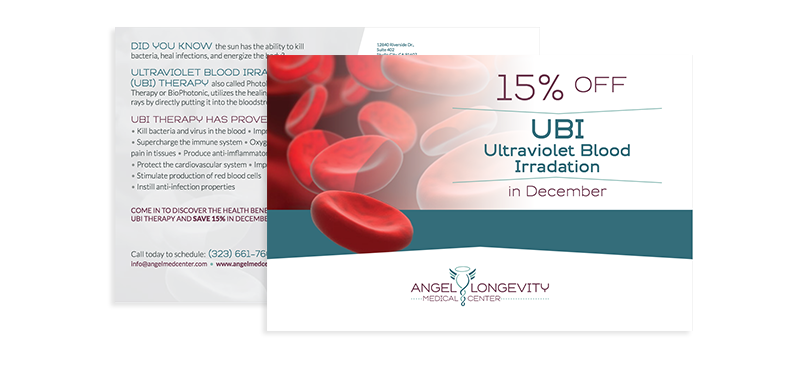
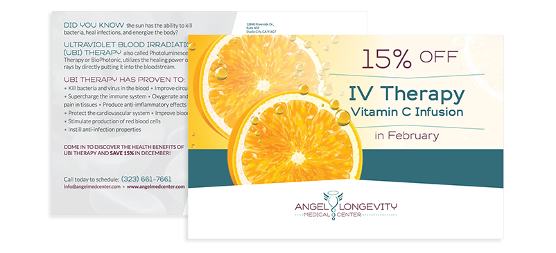
This logo was the beginning of a beautiful branding package. We spread these design choices throughout business cards stationery items, mailer postcards, brochures, and a full-fledged website, which can be viewed here.