Client: The Coding Bootcamp at UT Austin
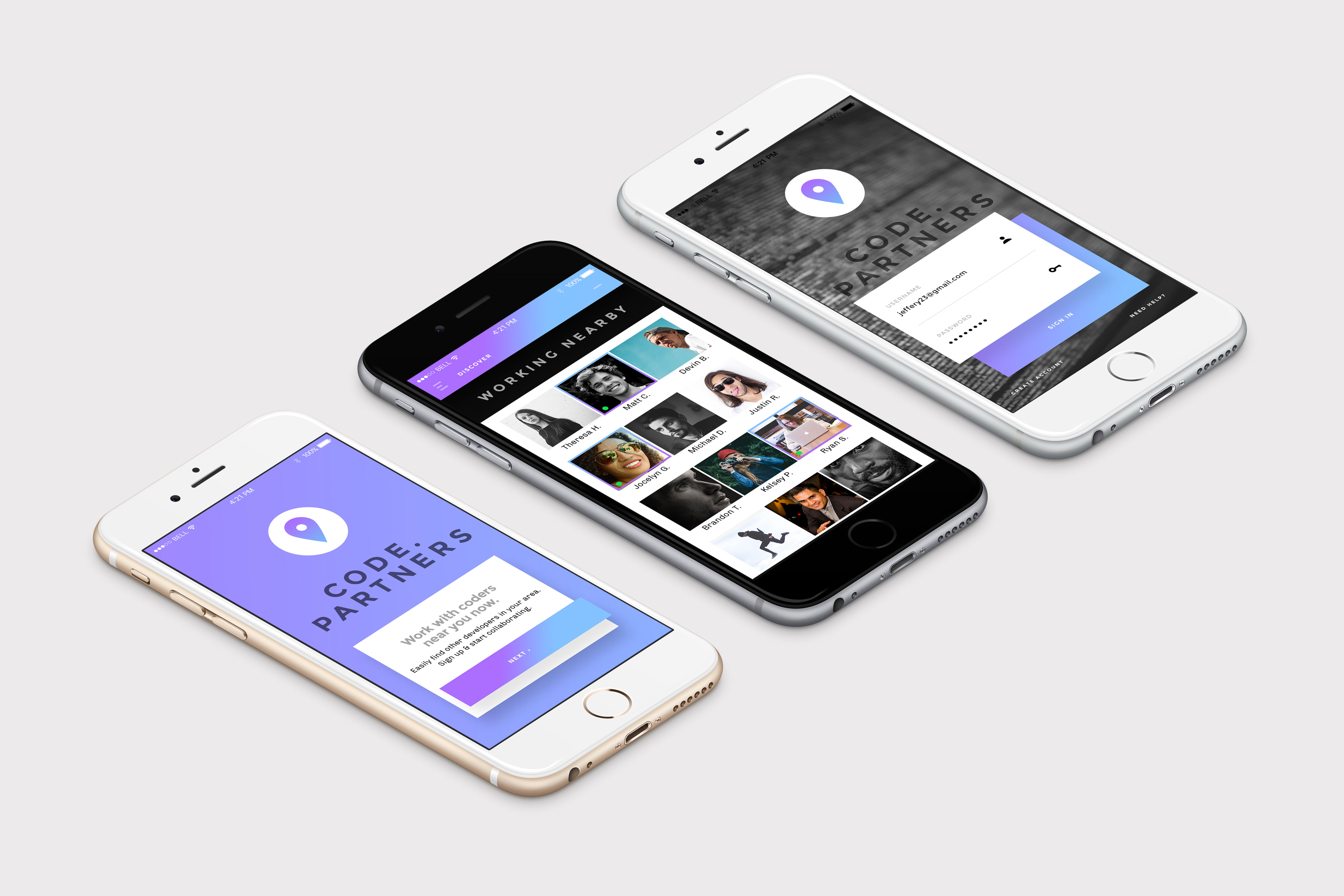
Idea: Code.Partners App
Goals: The overall goal of this project was to create a meaningful mobile app for the web development community.
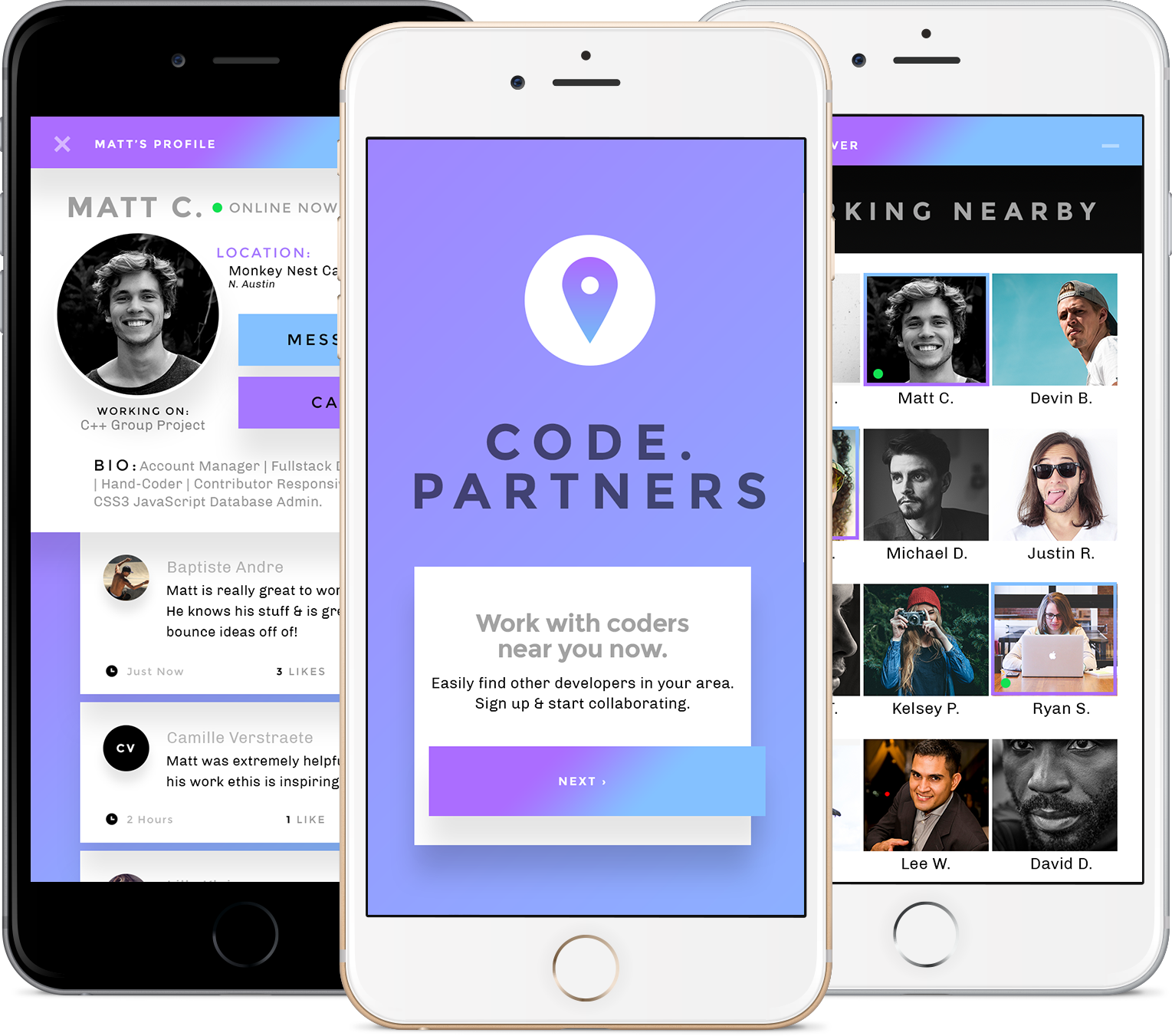
Strategy: I have learned a few things since I started dating a web developer. (1) They are always, always, working, and (2) they are very drawn to collaboration with other members of the web development community – very rarely, are they working on something solo. Thanks to technology, they can always chat or Slack each other for quick questions and/or discussion, but there really isn’t much that can replace working face-to-face with their fellow teammates. During my boyfriend’s training to become a web developer, he saw a great opportunity for an app that could increase awareness of those fellow coders – when they were working, what they were working on, and where they were currently located (i.e.: coffee shop, restaurant, etc.)
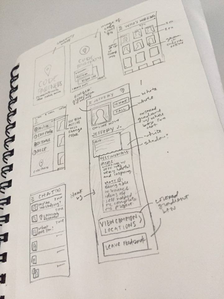
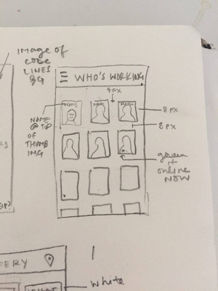
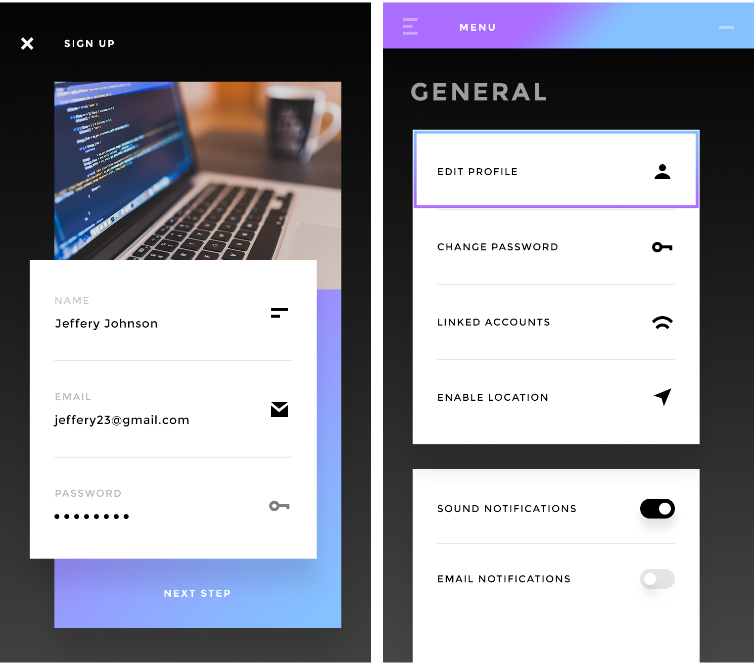
So together, we hit the ground running to create a prototype. I began working on the UI by gathering research for current UI trends and mobile apps that are of similar nature to Code.Partners. I knew I wanted to use the “location” icon for the app button, and found that in keeping the period or dot in between the words of the logo hinted to the fact that this is a logo for coders. For the interface, I decided to use a material design approach with bold and purposeful elements.
